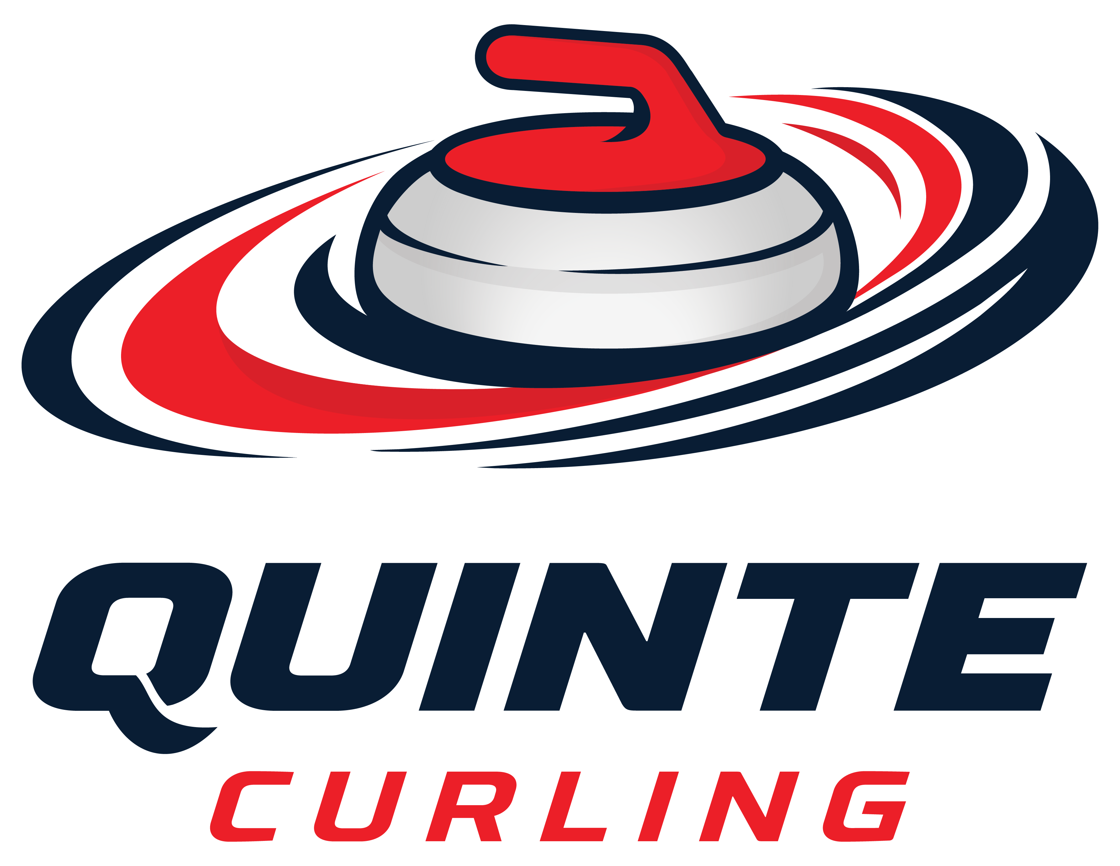

This Spring a new logo was was voted on for the Club.
At the heart of the design is a curling stone, the symbol that defines the spirit of the game. It also serves as a reminder of all the memorable moments shared on and off the ice by generations of curlers.
Surrounding the stone are the curling rings. They are more than a scoring area, the rings represent the circle of friendships, community and connection that make our club more than a place to curl - it's a place to come together.
This new logo embraces the future while honouring tradition.
It reflects our commitment to welcoming new curlers, fostering lifelong friendships and supporting our community while growing our game.
So as we go into this new curling season, let's look at this new logo as a symbol of who we are - a club built on tradition, strengthened by community, and united by our love of the game of curling.
Over the next week, you will see the new logo on our social media platforms as well as our website will be getting a fresh new look.
I just would like to remind you, if you are not following us on our socials, Facebook and Instagram, please do and share what we are posting. By sharing our posts, especially our events, registration and Learn to Curl it will give us a greater present in the community.
Before we know it, October will be here and we will be back on the ice. Until then, enjoy the rest of your summer and stay cool.